
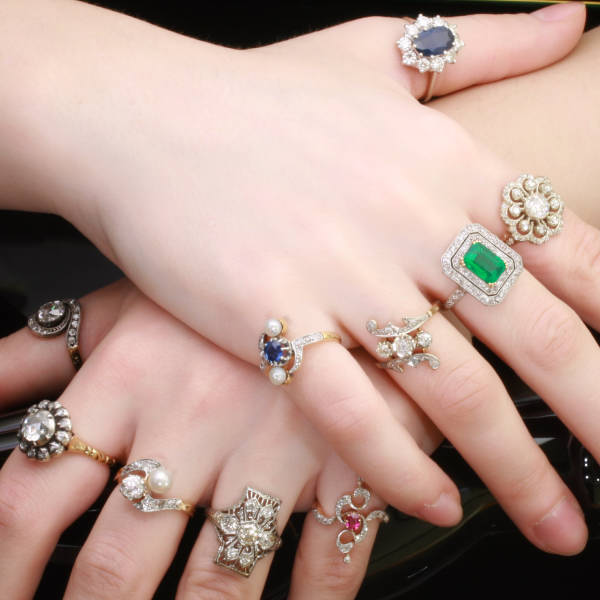

The images above are the three main influences upon my front cover image. I initially intended to use a model with curly, red hair as I think the colour will look effective next to my red, white and blue house colours of the magazine. Similarly, I decided that the photograph of the model would view them from the waist-upwards and so I was inspired by this red cardigan to have my model wear as it will match the model's hair colour and the colour scheme of the magazine. The pose I intend for my model to hold is to have their hands covering their face and I considered using rings on the model's fingers to enhance attractiveness as the hands will be a major part of the photograph. The above image of the hands with rings on them inspired me to use a lot of different sized rings and this will catch the reader's attention.


The three images above represent the main influences upon my decision to create my double page spread image. I came across the image on the left when undergoing my image analysis and have since intended to incorporate an image where the model wears a long trench coat as they are not entirely feminine or attractive as other costumes. I have already established that my article will make the reader empathise with the artist so I feel this choice of costume will help towards this. Looking at the image of the model, the coat draws sympathy from the reader and connotes that she is cold or not very well off and I aim to replicate this in my article image. The image of the coat on the right is similar to the one I aim to use in my photography. On the image on the left, my attention was drawn to the fact that the model is sitting on wood and I initially connected the wood with the coat as they use similar, natural colours and I considered having the model in a natural location. I thought about locations where my model will be surrounded by wood to create the same naturalistic connotations as the image on the left and was inspired by the image in the middle of the tree with its roots. I believe that the large tree roots present themes of mystery and magic so I intend to have my model sitting among some large tree roots and the emotions that the location will connote will work alongside the feelings of sympathy towards the model.


These two images provided more inspiration for images in my magazine. I came across the image on the left when undergoing my image analysis and decided that the brick wall backdrop could connote the artist's simplicity and connection to the audience. When researching similar images however, I came across the image on the right where I felt deep feelings of sympathy towards the girl in the photograph. I instantly realised that I deeply wanted to use a similar image in my magazine where the audience will feel a close sympathetic connection to the model and so when I take my photographs, I will ensure the model uses a similar pose. Additionally, the girl in the image is standing in a corner which connotes entrapment and draws sympathy and I aim to find a location where my model will look equally as trapped.
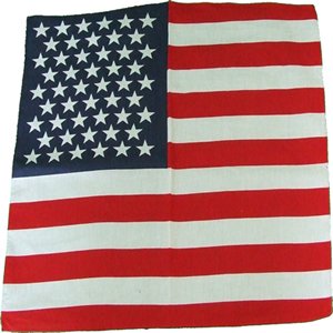

When creating my flat plans I recalled that I have a scarf which is similar to the one on the right, printed with the american flag. I also realised that this would make a useful prop as well as my union jack briefcase which is similar to those on the right. I decided that my model would use these props in my contents page main image as they are easy access and match the magazine colour scheme.

As I plan on using a lot of red in the costume, hair and props in my magazine images, I feel that using bright red lipstick on the model would be appropriate. I chose to use very bright red lipstick because it will stand out and draw the reader's attention more effectively than lighter or paler shades.
As I plan on using a lot of red in the costume, hair and props in my magazine images, I feel that using bright red lipstick on the model would be appropriate. I chose to use very bright red lipstick because it will stand out and draw the reader's attention more effectively than lighter or paler shades.
No comments:
Post a Comment