Welcome

Welcome to my blog. Here you will find research and planning, construction evidence and evaluation for my AS foundation Portfolio.

Monday, 16 April 2012

Evaluation Question 6

"What have you learnt about technologies from the process of constructing this product?"


During the course of this unit I have developed my photography skills and learnt how to use cameras and all of the different settings and functions on them. I have also learned how best to use a tripod and how best to hold a camera, what framing methods are most effective and how I can make images look better through more creative modelling. I have also learnt how to set up the lighting system and connect it to the camera.


These images are examples of how lighting can effect the outcome of an image. Without my lighting knowledge, images were dark and hard to see like the one on the left. However, the lighting highly enhanced the quality of my images once I had used the equipment which can be seen in the image on the right.

Thursday, 29 March 2012

Evaluation Question 5

I found from my primary research what my audience wanted to see in my media product:

  • Models that match the genre of the magazine through the use of costume, make-up and props
  • Content that appeals to the audience such as gig information and artists that match the indie genre
  • A contents page that is easy to read and find the necessary pages
  • Sell lines and skylines to attract the reader and make them want to read more of the magazine
  • An article that interests them and is relevant to the indie genre


Tuesday, 27 March 2012

Evaluation Question 4

Following secondary research in the initial stages of my project, I found the audience of Q magazine was made up of a mix of male and female readers and that they listen to indie music. I then conducted primary research which suggested that the audience was young people on average aged between sixteen to thirty. Therefore the target audience for my media product would be young male and females aged between sixteen and twenty five who are part of the indie culture.
This mood board shows images that sum up the indie culture. There are images which show their choice in clothing such as checkered shirts which are worn with the top button closed, floral dresses, chinos, straw hats and slogan t-shirts; it shows their alternative choice of hairstyles and a few of their preferred bands or artists of the indie genre such as Lana Del Rey, Florence And The Machine, Darwin Deez and Polarsets. It also highlights a few of their hobbies such as going to gigs or festivals, spending time outside (usually wearing floral dresses and straw hats in the summer) and social drinking with their friends.

Evaluation Question 3

This post is finished, I just need to upload my powerpoint into slideshare.

Evaluation Question 2

Evaluation Question 1

"In what ways does your media product use, develop or challenge forms and conventions of real media products?"


Friday, 9 March 2012

Specific Improvements

My finished rough cuts were analysed by my teacher and it was decided that I should make some changes to my product. The background needed to be changed and I needed to use bolder and more eye-catching fonts for more impact on the reader.
The contents page also needed to be changed as the subscription information was on its side and it was difficult to read which would mean that customers would not want to buy the magazine. The text I chose to use in my list of contents did not support numbers so I had to write my page numbers in word format which made the contents page look unprofessional. The font was also not very clear and I decided to use a clearer, bolder font.
I also needed to make some changes to the double page spread such as where the quote inserts are as they take up a lot of blank space towards the bottom. I needed to use a drop cap for the first letter of my article and I needed to include page numbers and more photos. the banner also used an inappropriate text.

On receiving this information, I decided to start my product again entirely.

Monday, 27 February 2012

Rough Cuts


Front Cover Construction

The following screenshots show the various stages of construction that occurred while I created my rough cut model of my magazine front cover.
In the programme Photoshop, I created a new document into which I inserted my background image sporting the three house colours of my magazine: red, white and blue. I then inserted my main image and used the eraser tool to erase the black background which I had used as a backdrop when taking the image in the photography studio. I then used the blur tool to soften the edges of the image so it looked more professional. I then adjusted the position of the image so that it was central on the page and changed the size of the image, leaving the right amount of background visible as I did not want to have too much unused background which would make the front cover look empty.
On the very top of the cover, I used the shape tool to create a rectangle, I adjusted the size so that it was large enough to hold text but so it was an appropriate size for a skyline. I then used the line tool to create a line that would separate the skyline from the rest of the magazine as I used the same colour of red to follow my colour scheme. I then inserted appropriate text using a font I had selected in my font research and changed the size so that it filled the skyline.  
I then created my masthead which consisted of two separate fonts that I had selected in my font research. I used an image of an eye which I used the paintbrush tool to draw over and add blue and red into the iris of the image so it matched my house colours. I organised the layering so that the text and the image was above a white box to separate the masthead from the rest of the front cover and used the line tool to create lines which also separate the masthead from the rest of the contents page. I then adjusted the size of the image and the text until they looked appropriate and fit within the white box I created using the shape tool.
I then created another white box using the shape tool and resized it so that it resembled the standard size for those on magazines which include the bar code, price and date. I inserted an image of a bar code and used the text tool to enter a date, website adress, price and issue number for my magazine. I then used the line tool to separate the box from the rest of the front cover.

I then began to create my sell lines. As I had left adequate space around my main image to include sell lines, I arranged them around the main image and organised the layering so that the sell lines around the head of the model in the image were positioned behind it as I did not want them to take away from the main feature of the image. I organised the layering of the sell lines which were to be at the bottom of the image, near the torso of the model so that they were in front of the image. I organised this complex layering in the hope that the front cover would look more professional and as though more time had gone into it. I used the same colour red to create the boxes for my sell lines as the one I had selected for my colour scheme and used the line tool to separate them from the rest of the front cover page. I then used a font that I found in my font research to create the text for my sell lines and coloured them in blue to match the colour scheme. I also coloured certain words in white as I wanted them to stand out against the blue and red.
The final part of my front cover page to be created was my main sell line which I created by using the shape tool to create two rectangles with rounded edges. I intended for my main sell line background to be white with a black outline around it to separate it from the rest of the front cover, however I was not able to use the line tool to make a curved line for the corners of my shape. I created my border by changing the colour of the second shape I had created to black and making the shape slightly larger than the first which was coloured in white. I used the rotation tool to tilt the two shapes and organised the layering so that the white shape was on top of the white, which looked as though it had a black border around it due to the black shape behind. I then inserted the appropriate text using a font I came across during my font research and used the rotation tool to tilt it so that it fitted the main sell line shape.

Thursday, 23 February 2012

Article Write-up

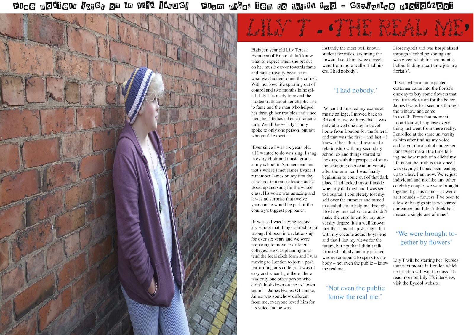
Eighteen year old Lily Teresa Everdeen of Bristol didn’t know what to expect when she set out on her music career towards fame and music royalty because of what was hidden round the corner. With her love life spiraling out of control and two months in hospital, Lily T is ready to reveal the hidden truth about her chaotic rise to fame and the man who helped her through her troubles and since then, her life has taken a dramatic turn. We all know Lily T only spoke to only one person, but not who you’d expect…

‘Ever since I was six years old, all I wanted to do was sing. I sang in every choir and music group at my school in Spinners end and that’s where I met James Evans. I remember James on my first day of school in a music lesson as he stood up and sung for the whole class. His voice was amazing and it was no surprise that twelve years on he would be part of the country’s biggest pop band’.
‘It was as I was leaving secondary school that things started to go wrong. I’d been in a relationship for over six years and we were preparing to move to different colleges. He was planning to attend the local sixth form and I was moving to London to join a posh performing arts college. It wasn’t easy and when I got there, there was only one other person who didn’t look down on me as “town scum” – James Evans. Of course, James was somehow different from me, everyone loved him for his voice and he was instantly the most well known student for miles, assuming the flowers I sent him twice a week were from more well-off admirers. I had nobody’.
‘When I’d finished my exams at music college, I moved back to Bristol to live with my dad. I was only allowed one day to travel home from London for the funeral and that was the first – and last – I knew of her illness. I restarted a relationship with my secondary school ex and things started to look up, with the prospect of starting a singing degree at university after the summer. I was finally beginning to come out of that dark place I had locked myself inside when my dad died and I was sent to hospital. I completely lost myself over the summer and turned to alcoholism to help me through. I lost my musical voice and didn’t make the enrollment for my university degree. It’s a well known fact that I ended up sharing a flat with my cocaine addict boyfriend and that I lost my views for the future, but not that I didn’t talk. I trusted nobody and my partner was never around to speak to, nobody – not even the public – know the real me. I lost myself and was hospitalized through alcohol poisoning and was given rehab for two months before finding a part time job in a florist’s’.
‘It was when an unexpected customer came into the florist’s one day to buy some flowers that my life took a turn for the better. James Evans had seen me through the window and come in to talk. From that moment, I don’t know, I suppose everything just went from there really. I enrolled at the same university as him after finding my voice and forgot the alcohol altogether. Fans tweet me all the time telling me how much of a cliché my life is but the truth is that since I was six, my life has been leading up to where I am now. We’re just individual and not like any other celebrity couple, we were brought together by music and – as weird as it sounds – flowers. I’ve been to a few of his gigs since we started our career and I don’t think he’s missed a single one of mine’.

Action Plan

Over the next few weeks I will be working hard to complete my assignment before the given deadline. To do this I will persistently keep motivated in lessons and use my free time inside and outside of college to keep myself ahead of the work.
Looking at the post in which I explain what changes I need to make to my research and planning to get my desired A grade, it is clear that I have a lot of work to do before I actually create my rouch-cut product.

Tuesday, 21 February 2012

What I Need To Do To Get An A Grade

To get my desired A grade, I need to include more detailed analysis on my Double Page Spread in the post where I researched similar products and analysed different magazines' Front Covers, Contents Pages and Double Page Spreads. There was more analysis on the Front Covers and Contents Pages than there was for the Double Page Spreads so I will edit the post and include more analysis.

I then need to choose two specific magazines to analyse which will give me more marks than looking at a wide range of different magazines and this will give me more of an idea of what I want my final product to look like. I also need to create a post discussing my target audience as I have not made it clear who I want them to be. I will analyse all of the elements of my target audience in the same way that NME did in their reader profile.

I will also make my flat plan rationale more detailed and give a description and annotation of the Recce and Model Release Forms as I have not yet done that. I also need to edit my posts and discuss how my research has affected my ideas for my final product because I have not done this consistently throughout.

Monday, 20 February 2012

Research Into Fonts

I searched the website www.dafont.com to find a range of possible fonts which I could use in my final product.


 When I created my flat plan, I ensured the masthead included one word of two fonts. One of them was bold and square while the other was round and curly. When I create my final product, I will incorporate these two fonts to make the title 'Eyedol'. The first three letters will use the JIMTHORPE font and the final three letters will use the Dutch and Harley font.


 I will use this font in my main sell line as it is flowery and will reflect the artist's feminine persona. This will stand out and be unique to the artist.


This Earwig Factory font stands out and is eye-catching. I will use this font to my advantage and allow it to fulfull its uses by using this font for my headings and subheadings in my magazine front cover, contents page and double page spread.


This Weird Cuts font is extremely eye-catching and unique which matches my indie genre. Each letter in this font is different from eachother and is appropriate for my magazine. I aim to use this font occasionally as it is very outstanding and could be too much if I use it too frequently so I will use it mainly for skylines and banners.


I chose to use this American Dream font with text related to the american themed image I will use on my contents page. As my model will wear accessories and carry props with the american flag on it, I will use this text to match the theme I aim to portray.


This One Direction font is less eye-catching and in the reader's face which is why I will use this font for the majority of my text such as on sell lines and subtitles. I feel that if I use too many eye-catching fonts, the consistency of the magazine will be lost and the product will not look as professional.

Recce

I filled in this Recce to give myself an idea of where I would shoot the images for my magazine front cover, contents page and double page spread. I provided a description of each location and an image to remind myself where it would be. I also briefly described how it was suitable for my photo-shoot and gave any additional comments that I felt I needed to make.

Friday, 10 February 2012

Model Release Forms

I asked my models to fill in these model release forms so that I could contact them and ensure that I would be able to access them when taking my photographs.

Hazard Evaluation Forms

I filled in these hazard evaluation forms to make me aware of the potential dangers that could affect my photography.

Flat Plan Rationale

Front Cover
My front cover of my magazine incorporates a skyline at the top of the page with large bold text to draw the customer's attention which is amplified by the choice of words used such as 'exclusive' and 'VIP' to make the reader feel included in something they wouldn't usually be permitted access to. The masthead is large so that it stands out and makes the product recognisable from other magazines and the distinctive, unique logo of an eye is both interesting with it's coloured iris and different from any other magazine's logo. The title of the magazine - 'eyedol' - is written in two fonts to allow the consumer to distinguish between the two separate words: 'eye' and 'dol'. The pun in the title is that the eye logo matches the spelling of the title. The box in the bottom right hand corner separates the standard pieces that are usually expected to be found there from the rest of the front cover such as the date, the magazine's website address, the price of the magazine, issue number and the bar code. The sell lines incorporate eye-catching pieces of information that are relevant to the content of the magazine and the main sell line is large and eye-catching as it uses similar language techniques as the skyline such as 'up-close' and 'personal' to make the reader feel included in a special edition of information which makes the reader feel as though they are being treated. The main image depicts the model displaying a unique pose and the background is both eye-catching and unique. It uses red, white and blue colours which set the house colours of the magazine and which are mirrored in the skyline, masthead, main sell line and sell lines around the page. The model wears red clothing and nail polish to follow the consistent colour scheme and her ginger hair fits in with the indie genre and follows the colour scheme.

Contents Page
The contents page depicts the title ('CONTENTS') at the top of the page above a page that appears to be split into two sections. The column on the left is a list of contents which is split into three sections: the first focuses on the featuring artist ('Lily T Special'), the middle section focuses on 'FREE Posters' and the final section is made up of gigs and upcoming events. In each section is a list of each of the pages with their page numbers and at the very bottom of the column is a separate box which has written in it 'next week' and a page number so the reader can easily locate the page where the magazine reveals the following week's issue. The column on the right is considerably wider than the latter and is also split into three sections. The top section incorporates a range of assorted images, indicating the content of the magazine. In the bottom section of the column is a box with subscription information below the main image of the contents page. This box depicts a triangular shaped American flag to hold the text ('America's Freshest Artist '12') and the main image of the page where the model wears an American flag scarf and sits on a chair holding a prop which is a briefcase with the American flag on it. The American theme of this section follows the red, white and blue colour scheme of the magazine which is used consistently throughout. This is displayed in the title, the list of contents and its sub-headings and the text in the various sections of the page.

Double Page Spread
The double page spread is made up of two sides. The left page is taken up entirely by a large image of the featuring artist who is wearing clothes that match the colour scheme of the magazine. The right hand side incorporates a red banner with the article title above the article itself in which three main quotes stand out from the rest of the article to draw the reader's attention and persuade them to keep reading. At the top of the page is a very thin banner informing the reader of content that will appear later in the magazine to urge the reader to read on.

Thursday, 9 February 2012

Test Shots

I took a range of test shots to allow me to see what my final images would look like. I practiced poses and locations to give me an idea of how my final images will look.


 I asked my model to practice this pose as I knew I wanted an image in my magazine where the model is sitting on a chair. The image on the right has allowed me to see that I want to use a low angle shot to give emphasis on the model's crossed leg which looks larger and more prominent.


In these images, I asked the model to pose against a brick wall as I aim to use a similar image to emphasise the urban location. I asked the model to practice a range of different poses and used different angles to allow me to make a final decision.


 In these three images, I asked the model to crouch in a natural location where I can show emphasis on the scenery. I asked the model not to look at the camera and look into the distance to portray a sense of calmness and serenity which I will aim to incorporate in my magazine.

For the image on my front cover, I had already decided that I wanted the image to be of a ginger haired female model with her hands covering her face and to be wearing a red jumper. I tried to replicate this in these images and decided that they are suitable for my front cover.