The flat plan for my magazine front cover incorporates the purple, grey and yellow house colours which I aim to use for my preliminary magazine. The masthead 'We R Young' is large and has an attractive layout which draws the target audience's attention. My magazine is for a college and is aimed at people aged 16 to 18 and so I used bright, eye-catching colours in my text and backgrounds. I chose these colours because they encapsulate what my magazine is about: the purple and yellow are the standard house colour for QE College which is the college that my magazine is aimed at and the grey in my 3 pallet rule colour scheme portrays the feel of simple cool which my target audience relate to. 'We R Young' uses an abbreviation for the word 'are' which is common among teenagers and relates to their interests; by using the word 'we', I ensured that the magazine title includes the audience as though it speaks directly to them.
Above my masthead is the skyline which I used as a banner to advertise that the Freshers Fayre is currently at the college. This gives the reader an idea of the features in the magazine.
I used a large colourful image of coolly posed teenagers (relating to the target audience) to draw appeal. I used the usual waist-upwards camera angle for my image as most magazine covers' photographs follow this camera angle.
My main sell line is large and bold to draw the readers' attention and the smaller, colourful sell lines on the sides show different features in the magazine with a colourful red background behind them which is called a banner.
I also included a bar code and price of the magazine which is an appropriate £3.80 so readers can see the price of the magazine.
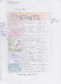
The contents page of my magazine also follows the 3 pallet rule and uses purple, grey and yellow as they are the house colours for my magazine. However, three of the images which I used to promote the content of the magazine, use different colours (red, green and blue) because they are advertisements and I intended for these to stand out.
At the bottom of my contents page, I included a section for subscription information which most magazines also have.
My table of contents is the main feature of the contents page which has a list of the titles of pages in the magazine with a column of page numbers. I listed these pages in order of efficiency (library inductions and bus times) to general interest (student association feedback, top ten back to school outfits and a page including information on next week's issue of the magazine).
I used these features to make my contents page both attractive and easy to read as well as making it appeal to my target audience which, in my opinion, I think works quite effectively.


No comments:
Post a Comment